Marty’s weight
Marton Kiss MD
2024-09-23
Source:vignettes/splines_vignette.rmd
splines_vignette.rmdMotivation
I have an excel file with all of my (known) recorded weights including the ones I recorded when I was into (extended) intermittent fasting. I want to fit an intuitive model describing my mass as a function of time.
My long term motivation is to both build a descriptive model of my weight and also to build a predictive model to forecast my weight for the next 30 days in the hopes of that my recent changes would inform the model and me what to expect given a somewhat constant set of behavior.
It seems that after the optimization presented below the resulting model can achieve both goals.
Methods
I’m using natural splines with a method for determining knot placements; I’m setting a knot after ‘k’ days of valid observations.
A necessary exercise is to determine the ‘best’ value for ‘k’.
Another parameter is the number of observations after the last knot (d), as in is it better for prediction purposes to have the last knot closer to the borders of the data (outside of which the function is linear) or to have some data after the last knot.
For optimizing k and d, I used rolling forecasts, as in: - fitting a model with a given d & k on data up until a certain date - predicting all observations based on the model after that date during a 30 day window - calculating the RMSE between the predicted and observed values - repeating the above steps when the data used for model fitting (the training data) gets extended anoter 30 days - summing up the RMSEs for each model which was fitted - See what k,d pair produces the smallest summed up RMSE
(Note: This optimization is somewhat lengthy, so it was done once and I did not update it since 2023-11-20).
library(dplyr)
library(ggplot2)

res_path <- here::here("inst", "spliney", "crossval_results",
    "roll_forecast_lastday_results.rdata")
load(file = res_path)

out_groupped <- out %>%
    group_by(k, days_before_last) %>%
    mutate(mad_mean = mean(mad, na.rm = TRUE), rmse_mean = mean(rmse,
        na.rm = TRUE), cor_mean = mean(abs(cor.), na.rm = TRUE),
        nas = sum(is.na(mad))) %>%
    slice(1)


out_groupped %>%
    mutate(days_before_last_perc = days_before_last_perc * 100) %>%
    dplyr::rename(`d%` = "days_before_last_perc") %>%
    ggplot(aes(x = k, y = rmse_mean, group = `d%`, color = `d%`)) +
    theme_bw() + scale_y_continuous(limits = c(0, max(out_groupped$rmse_mean))) +
    geom_point(alpha = 0.25) + geom_line(alpha = 0.125) + labs(y = "mean RMSE",
    caption = "'d' was between 0 and 80, color is given as percentage of max d")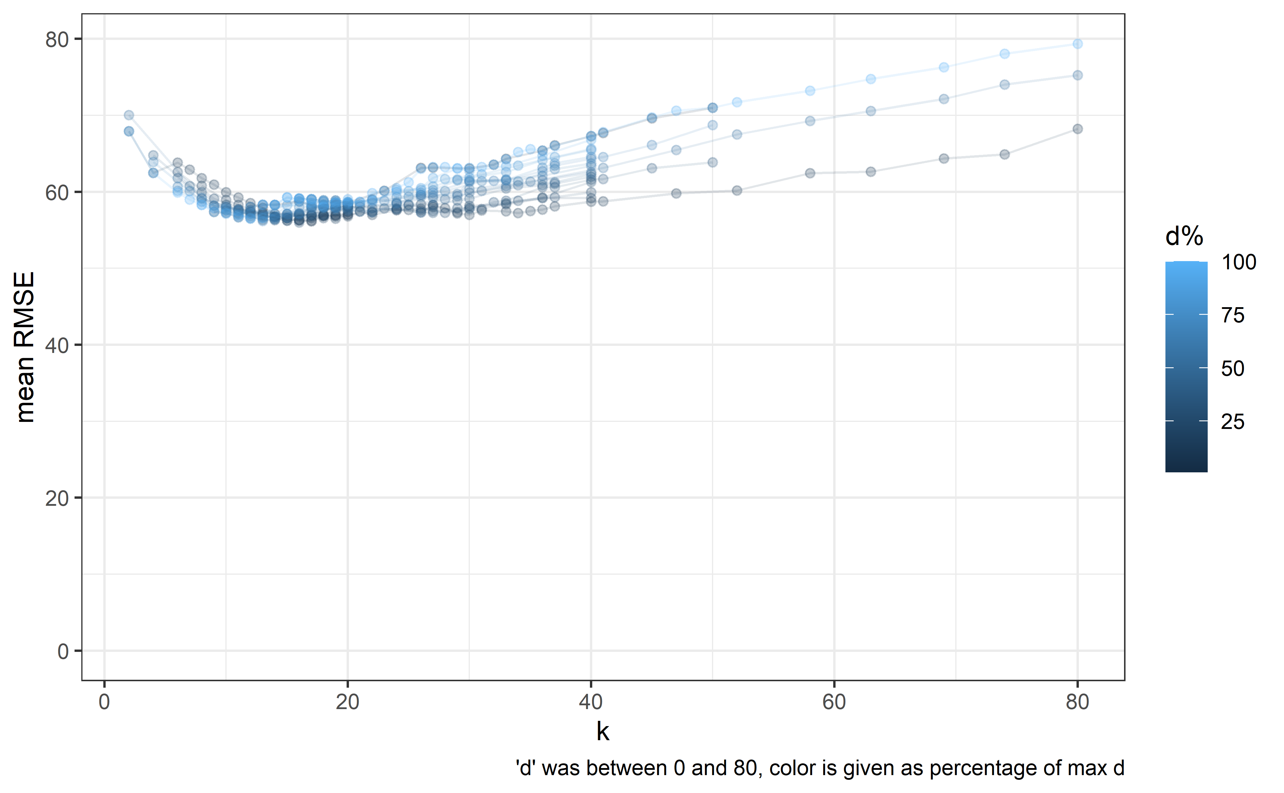
Alternative models
I’m also not sure whether linear, GLS, or mixed modelling is the best approach here as the vanilla linear model is expected to result in a model with a high autocorrelation within its residuals.
GLS
When switching out the model for a GLS one modelling variance with varPower() in keeping with the tendency for the scales to measure with greater uncertainty as the weight gets higher. The RMSE from these models jumps to ~2x, as well as suggesting widely different parameters. Fitting autoregressive models caused nonconvergence. Considering it a dead end.
out_groupped_bu <- out_groupped  # backing up due to state change, bad form

res_path <- here::here("inst", "spliney", "crossval_results",
    "roll_forecast_lastday_results_gls.rdata")
load(file = res_path)

out_groupped <- out %>%
    group_by(k, days_before_last) %>%
    mutate(mad_mean = mean(mad, na.rm = TRUE), rmse_mean = mean(rmse,
        na.rm = TRUE), cor_mean = mean(abs(cor.), na.rm = TRUE),
        nas = sum(is.na(mad))) %>%
    slice(1)


out_groupped %>%
    mutate(days_before_last_perc = days_before_last_perc * 100) %>%
    dplyr::rename(`d%` = "days_before_last_perc") %>%
    ggplot(aes(x = k, y = rmse_mean, group = `d%`, color = `d%`)) +
    theme_bw() + scale_y_continuous(limits = c(0, max(out_groupped$rmse_mean))) +
    geom_point() + geom_line(alpha = 0.25) + # add the other pic's data in red for comparison geom_point()
    geom_point() + geom_line(alpha = 0.25) + # add the other pic's data in red for comparison +
    geom_point() + geom_line(alpha = 0.25) + # add the other pic's data in red for comparison geom_line(alpha
    geom_point() + geom_line(alpha = 0.25) + # add the other pic's data in red for comparison =
    geom_point() + geom_line(alpha = 0.25) + # add the other pic's data in red for comparison 0.25)
    geom_point() + geom_line(alpha = 0.25) + # add the other pic's data in red for comparison +
    geom_point() + geom_line(alpha = 0.25) + # add the other pic's data in red for comparison #
    geom_point() + geom_line(alpha = 0.25) + # add the other pic's data in red for comparison add
    geom_point() + geom_line(alpha = 0.25) + # add the other pic's data in red for comparison the
    geom_point() + geom_line(alpha = 0.25) + # add the other pic's data in red for comparison other
    geom_point() + geom_line(alpha = 0.25) + # add the other pic's data in red for comparison pic's
    geom_point() + geom_line(alpha = 0.25) + # add the other pic's data in red for comparison data
    geom_point() + geom_line(alpha = 0.25) + # add the other pic's data in red for comparison in
    geom_point() + geom_line(alpha = 0.25) + # add the other pic's data in red for comparison red
    geom_point() + geom_line(alpha = 0.25) + # add the other pic's data in red for comparison for
    geom_point() + geom_line(alpha = 0.25) + # add the other pic's data in red for comparison comparison
geom_point(data = out_groupped_bu %>%
    dplyr::rename(`d%` = "days_before_last_perc"), aes(y = rmse_mean),
    color = "red") + labs(y = "mean RMSE", caption = "'d' was between 0 and 80, color is given as percentage of max d\nRed points are the results from the linear model")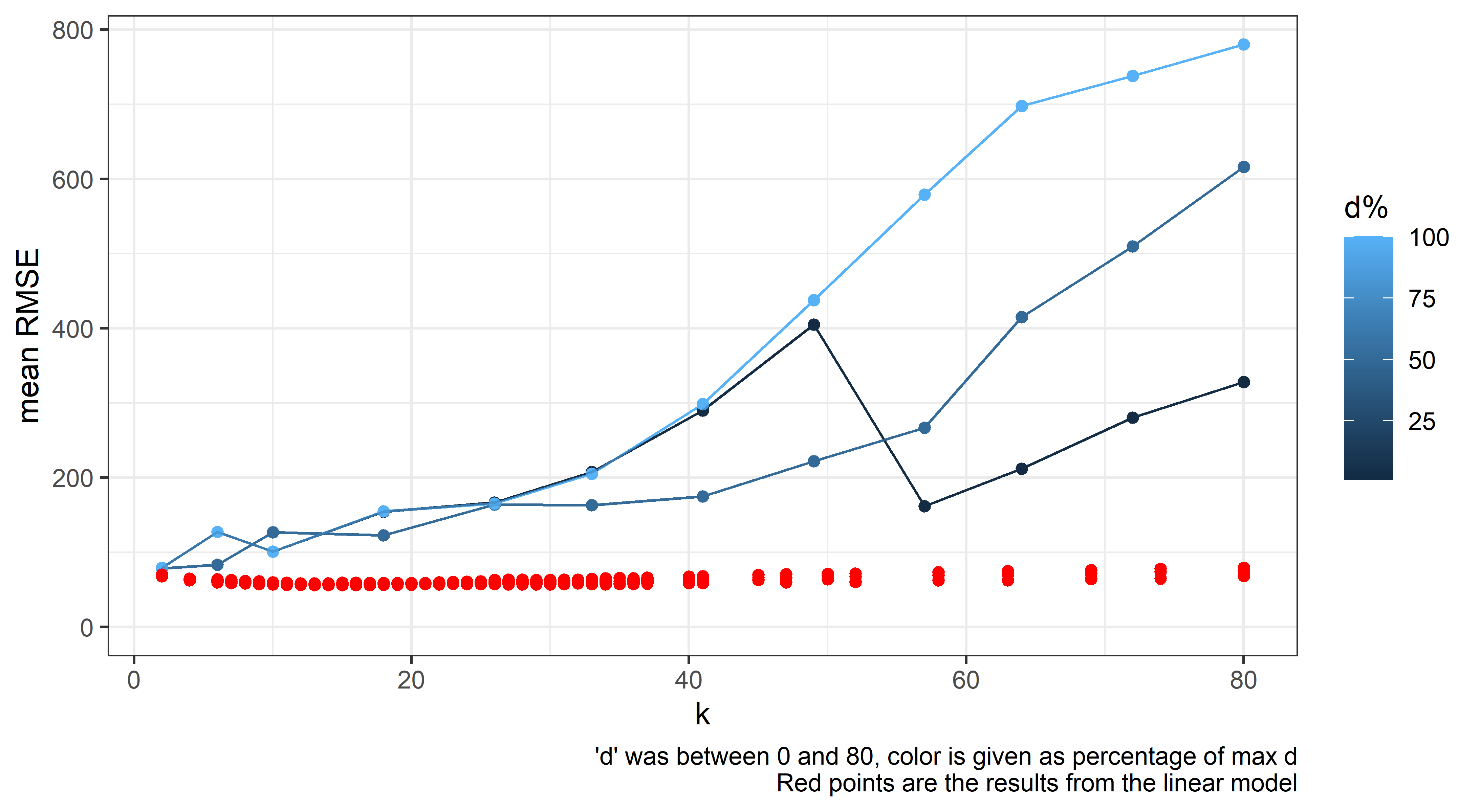
LME
Attempted to fit an lme() model with ‘episodes’ between feedings as random effects (intercept or slope+intercepts with time since last feeding). When attempting to fit the model however, it would not converge, possibly due to the sparse nature of the observations, eg. few ‘episodes’ have 2 or more observations. (This approach worked better when I was more obsessive, and recorded multiple measurements between feedings.)
Results
The above parameters were fixed as k = 13 and d = 9. The resulting model is good for prediction as per the optimization of the parameters done before and it seems to decently capture the observed dynamics through the years.
It is my experience that when modelling a time series with a spline especially with not-missing at random data the ‘real’ concern is information overload for the observer, as in a model with fewer knots capture the underlying tendencies with less precision but may be better interpreted for some stakeholders.
In this example observations were made more often when I was motivated to modulate (lose) weight and this stark deviation from random made this example fun for me.
The underlying problem stated another way is how to handle periods of extremely sparse information.
Placing knots at regular intervals as denoted by the available information seems like a natural move.
I’m certain that for someone with different habits concerning weight data collection, these hyperparameters (k, d) would be different and should be revisited if my habits regarding their collection change significantly.
library(readxl)
library(splines)
library(ggplot2)
library(dplyr)
library(lubridate)

setwd(here::here())

#####

k <- 13
days_before_last <- 9

#####
dat <- here::here("inst","extdata","martysweight.xlsx") %>%
  read_excel( col_types = c("date", "numeric", "numeric",
                            "numeric", "numeric", "numeric","numeric")) %>%
  filter(is.na(Mass) == FALSE) %>%
  mutate( Time_hours = ifelse( is.na(Time_hours)== TRUE, 12, Time_hours),
          Time_minutes = ifelse( is.na(Time_minutes)== TRUE, 0, Time_minutes),
          Time_fasted_hours = ifelse( is.na(Time_fasted_hours)== TRUE,
                                      4, Time_fasted_hours),
          Time_fasted_minutes = ifelse( is.na(Time_fasted_minutes)== TRUE,
                                        0, Time_fasted_minutes),
          numd = as.numeric( Date
                             + Time_hours * 3600
                             + Time_minutes * 60
                             - min(Date)) / 24,
          fastd = Time_fasted_hours + Time_fasted_minutes / 60,
          fastd_truncated = ifelse( fastd > 16, 16, fastd),
          maxinlast = 0
  )   %>%
  arrange(., numd)

##########
# Episodes setup

# Assuming 'dat' is your data frame
dat <- dat %>%
  mutate(
    fast_start =  round((numd - fastd /24)*7
                        , digits = 1)/7,
    fast_diff =  fast_start - lag(fast_start)

  )

##########

days_unique <- unique(floor(dat$numd))
days_as_knots <- seq(k,length(days_unique),by= k)
days_before_last_act <- length(days_unique) - dplyr::last(days_as_knots)
days_before_diff <- days_before_last_act - days_before_last
days_as_knots_corr <- days_as_knots + days_before_diff
days_as_knots_corr <-
  days_as_knots_corr[ days_as_knots_corr > 10 & # hard coded
                        days_as_knots_corr < length(days_unique)]

knot <- dat %>%
  filter(floor(numd) %in% days_unique[days_as_knots_corr]) %>%
  .$numd %>%
  floor %>%
  unique


expre <- paste(knot,collapse=",") %>%
  paste( "c(", ., ")") %>%
  paste("Mass ~ ns( fastd, df = 1) + ns(numd, knots =", ., ")"
  ) %>%
  as.formula(.)

mod <- lm( expre,
            control =  lmeControl(maxIter = 2000,
                                  msMaxIter = 3000,
                                  niterEM = 400,
                                  msVerbose = FALSE,
                                  tolerance = 1e-6,
                                  msTol = 1e-6),
            data = dat)


dat_p <- expand.grid( fastd = c(8),
                      numd = seq(1,max(dat$numd)+30,.1),
                      maxinlast = 12
                      ) %>%
  mutate( fastd_truncated = fastd)
dat_p$pred <- predict(mod, newdata = dat_p, level = 0)

dat_p$numd <- as.Date( dat_p$numd, origin = min(dat$Date))
dat$Date2  <- as.Date( dat$numd,   origin = min(dat$Date))

dat_p %>%
  filter(fastd==8) %>%
  mutate(hours_fasted = fastd) %>%
  ggplot(aes(x=numd, y = pred, color = hours_fasted)) +
    theme_bw() +
    theme(panel.grid.major.x = element_line(colour = "grey40"),
          panel.grid.minor.x = element_line(colour = "grey40")) +
    geom_point(data = dat,
               aes(x = Date2, y = Mass,
                   color=fastd, group = Episode)
               , size = 1, alpha = .5) +
    scale_y_continuous(limits = c(60,89)) +
    geom_vline(xintercept = days(floor(knot)) + min(dat$Date2), alpha = .5,
               color = "#AEEEEE", linetype = "dashed") +
    geom_line(linewidth=1.1, color = "salmon4") +
    scale_x_date(date_breaks = "2 years",date_minor_breaks = "1 year", date_labels = "%y") +
    labs( x = "Date (Year)",
          y = "Mass (kg)")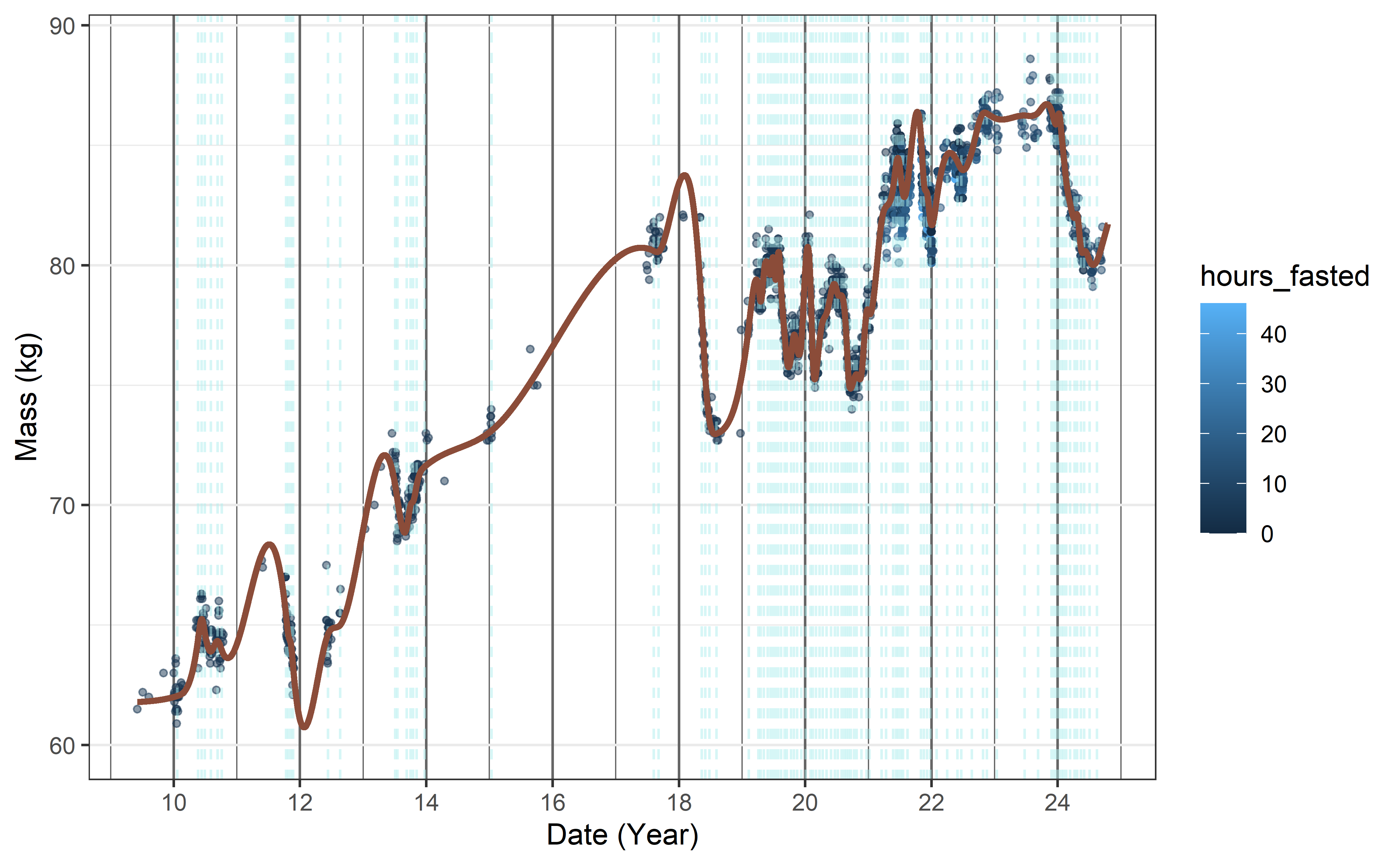
Trying out the model’s predictive powers, here is the projection for the next 30 days. Per the natural spline’s definition, it should be linear. While the knot placement was optimized for predicting this interval, but it should be kept in mind that changing ‘behavior’ mid-period (eg. starting/giving up a diet 2 weeks after the last observation) should seriously impact the results.
dat_p <- expand.grid( fastd = c(0,8,12,16,24),
                      numd = seq(5332,#max(dat$numd)-60, # start of sema
                                 max(dat$numd)+30,.1),
                      maxinlast = 8
                      ) %>%
  mutate( fastd_truncated = fastd)

dat_p$pred <- predict(mod, newdata = dat_p, level = 0)

dat_p$numd <- as.Date( dat_p$numd, origin = min(dat$Date))
dat$Date2  <- as.Date( dat$numd,   origin = min(dat$Date))

dat_p %>%
  mutate(hours_fasted = fastd) %>%
  ggplot(aes(x=numd, y = pred, color = hours_fasted)) +
    theme_bw() +
    theme(panel.grid.major.x = element_line(colour = "grey40"),
          panel.grid.minor.x = element_line(colour = "grey40"),
          # smaller x axis text
          axis.text.x = element_text(size = 7)
          ) +
    geom_point(data = dat %>% filter(numd>5332), #max(numd)- 60),
               aes(x = Date2, y = Mass,
                   color=fastd, group = Episode)
               , size = 1, alpha = .5) +
    #scale_y_continuous(limits = c(60,89)) +
    geom_vline(xintercept = days(floor(knot)) + min(dat$Date2), alpha = .5,
               color = "#AEEEEE", linetype = "dashed") +
    geom_line(mapping = aes(group = factor(fastd)), linewidth=0.5) +
    scale_x_date(date_breaks = "8 weeks",date_minor_breaks = "4 weeks"
                 #, date_labels = "%y"
                 ) +
    labs( x = "Date (Year)",
          y = "Mass (kg)")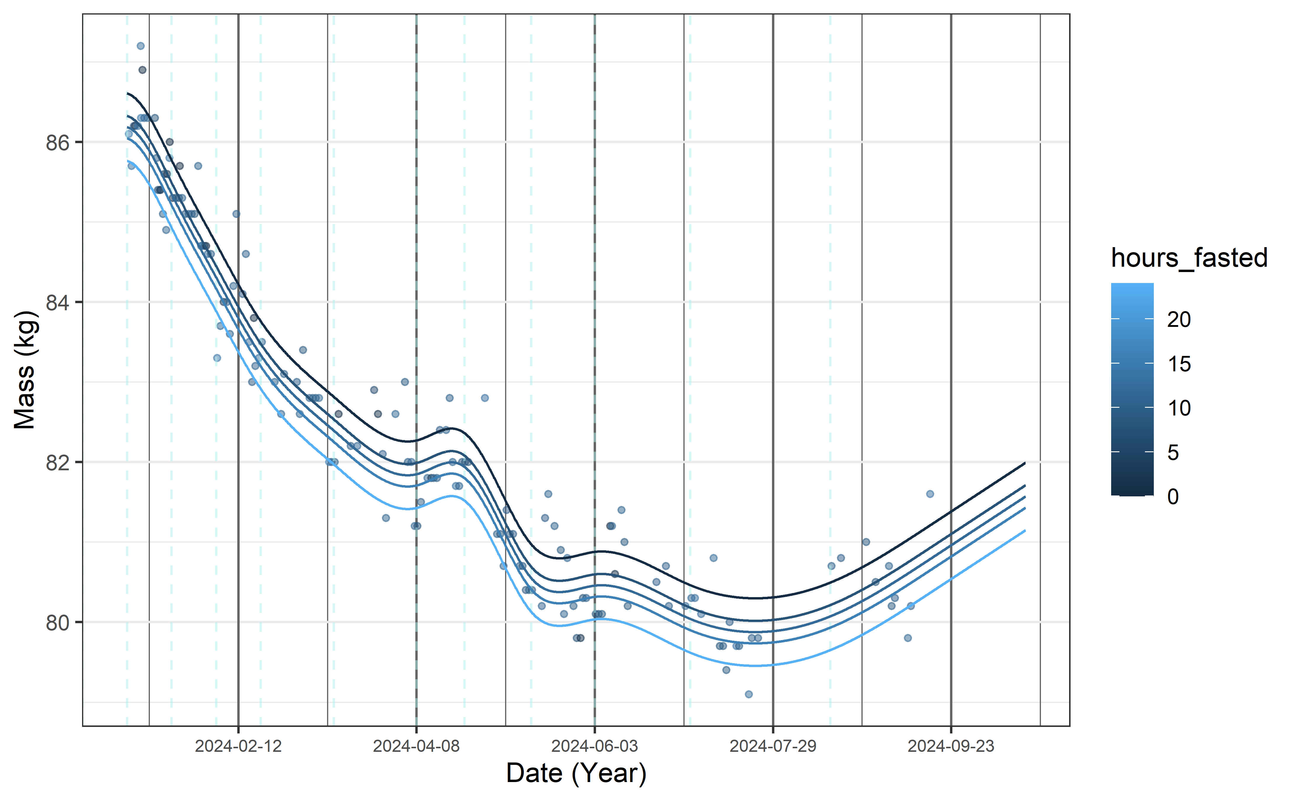
Diagnostics
This section is only interesting if you are interested in the model fit, and how correct some of the model’s base assumption may be.
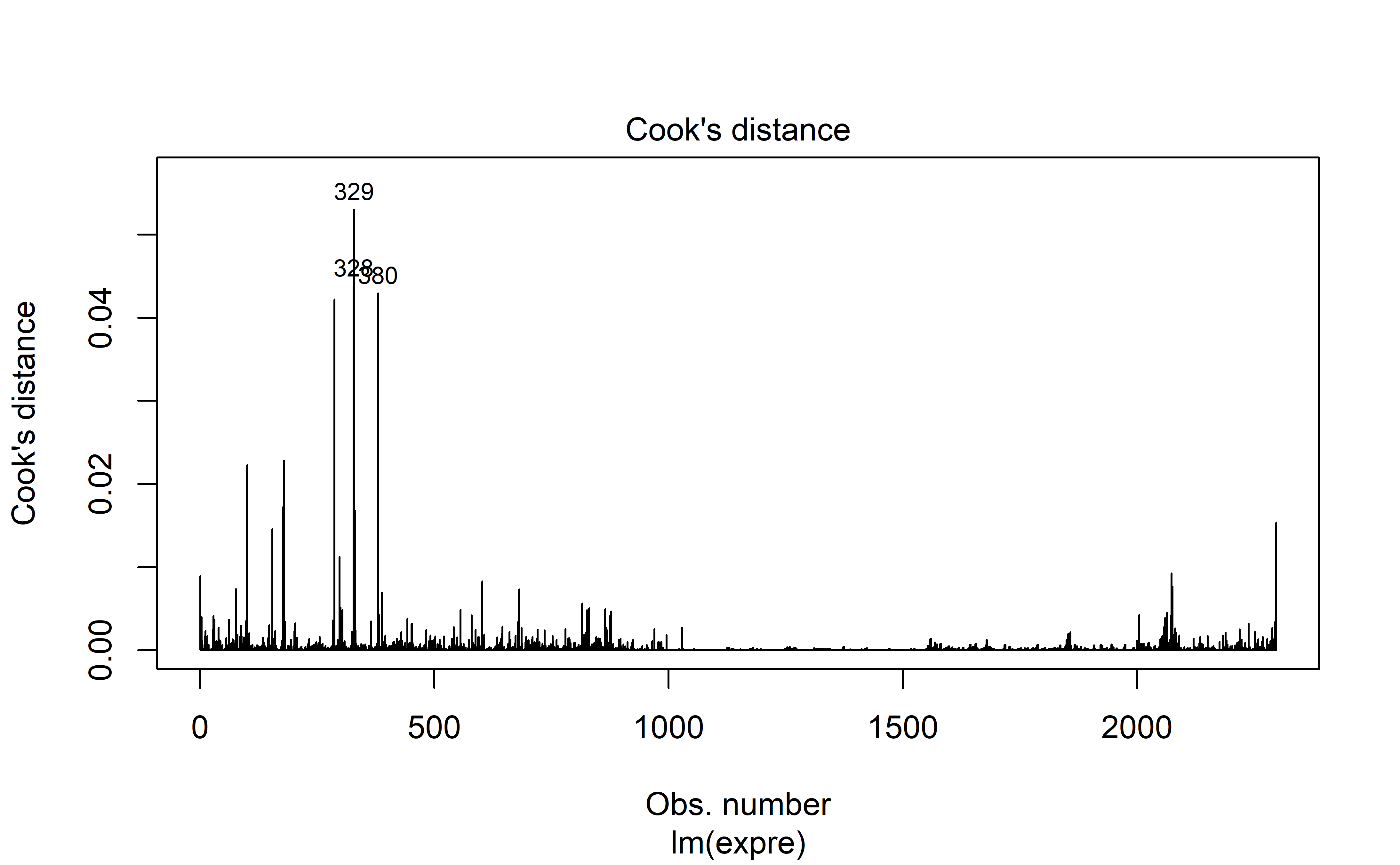
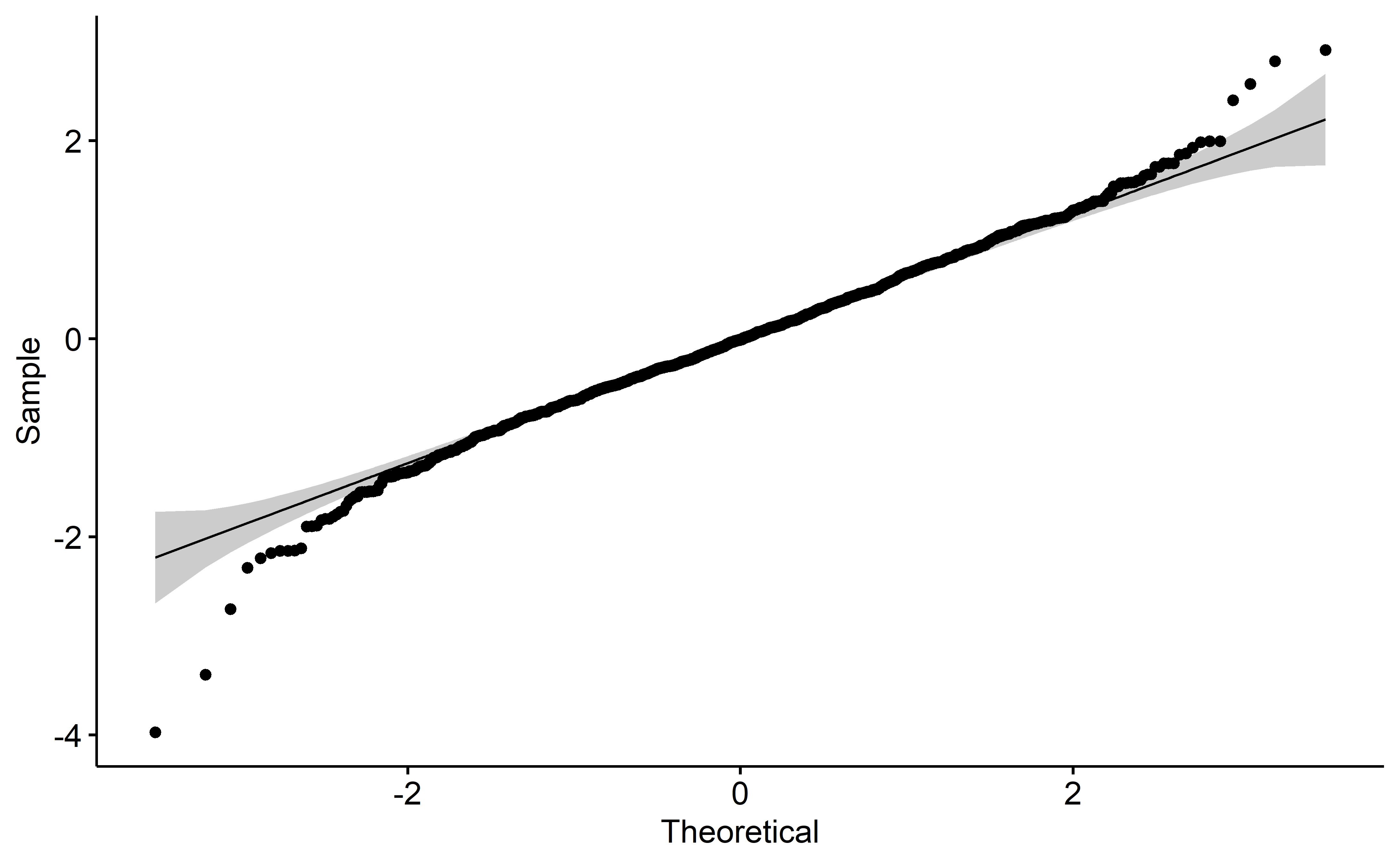
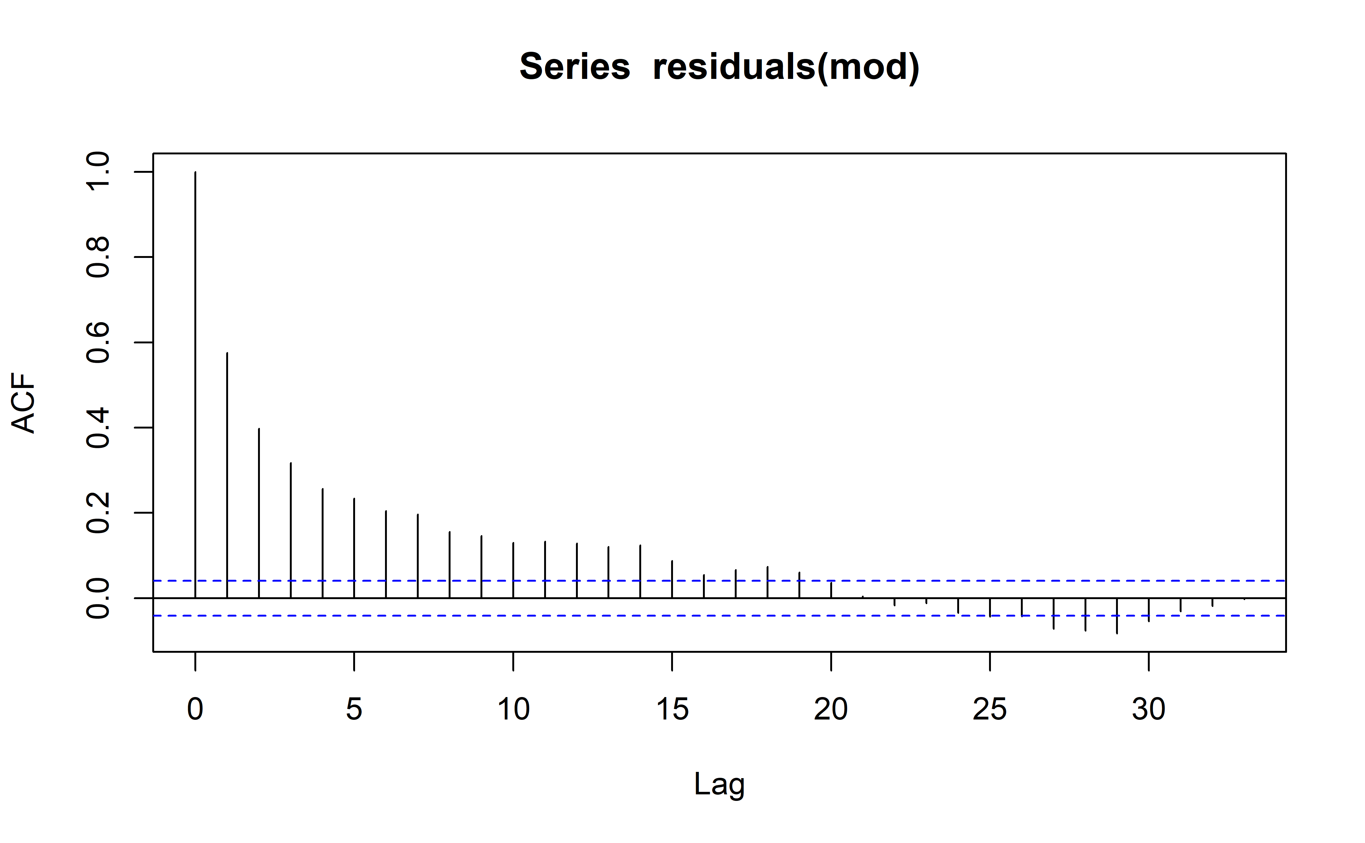
Model diagnostics are acceptable (to me) which is great news. Autocorrelation is high unfortunately, but perhaps in light of the hyperparameter optimization with rolling forecasts, this may be excused.
plot(mod, 1)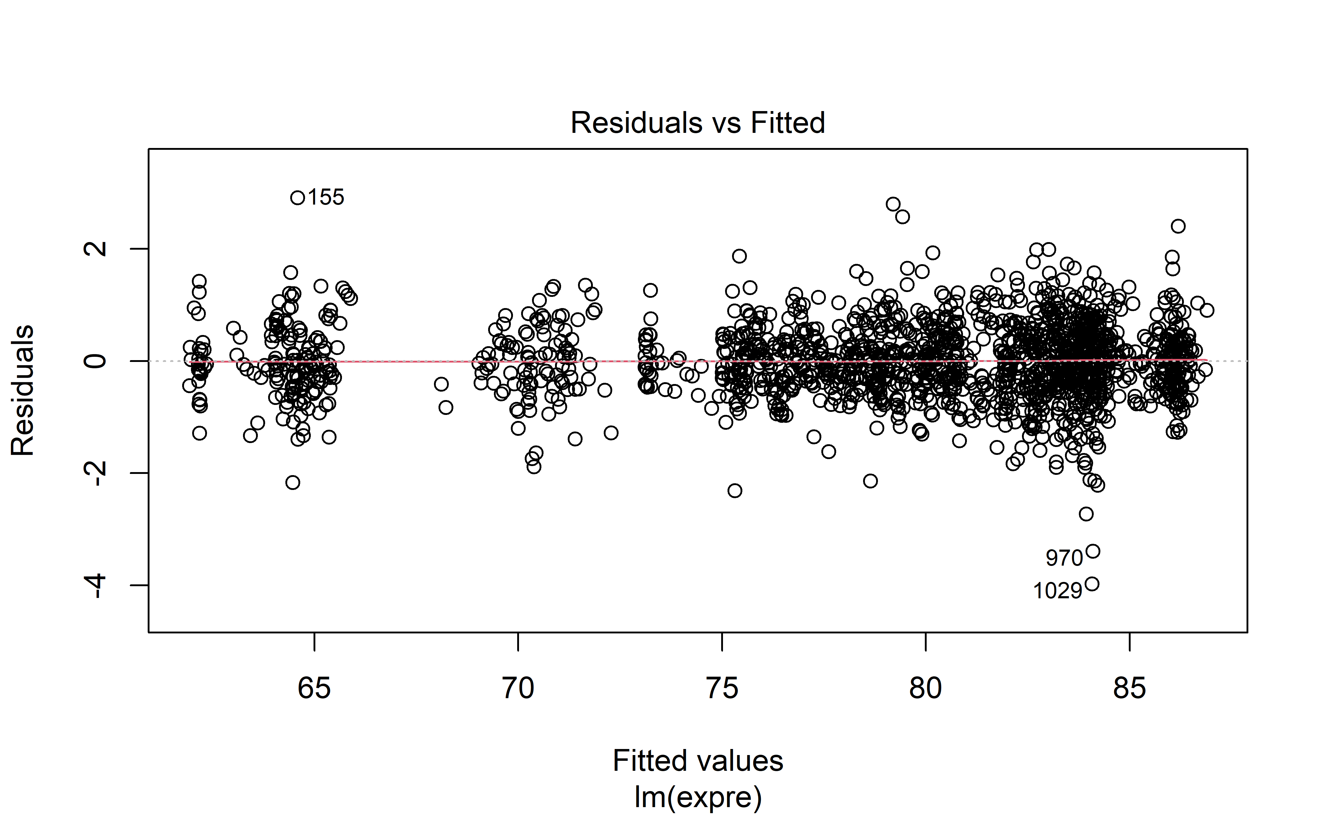
plot(mod, 3)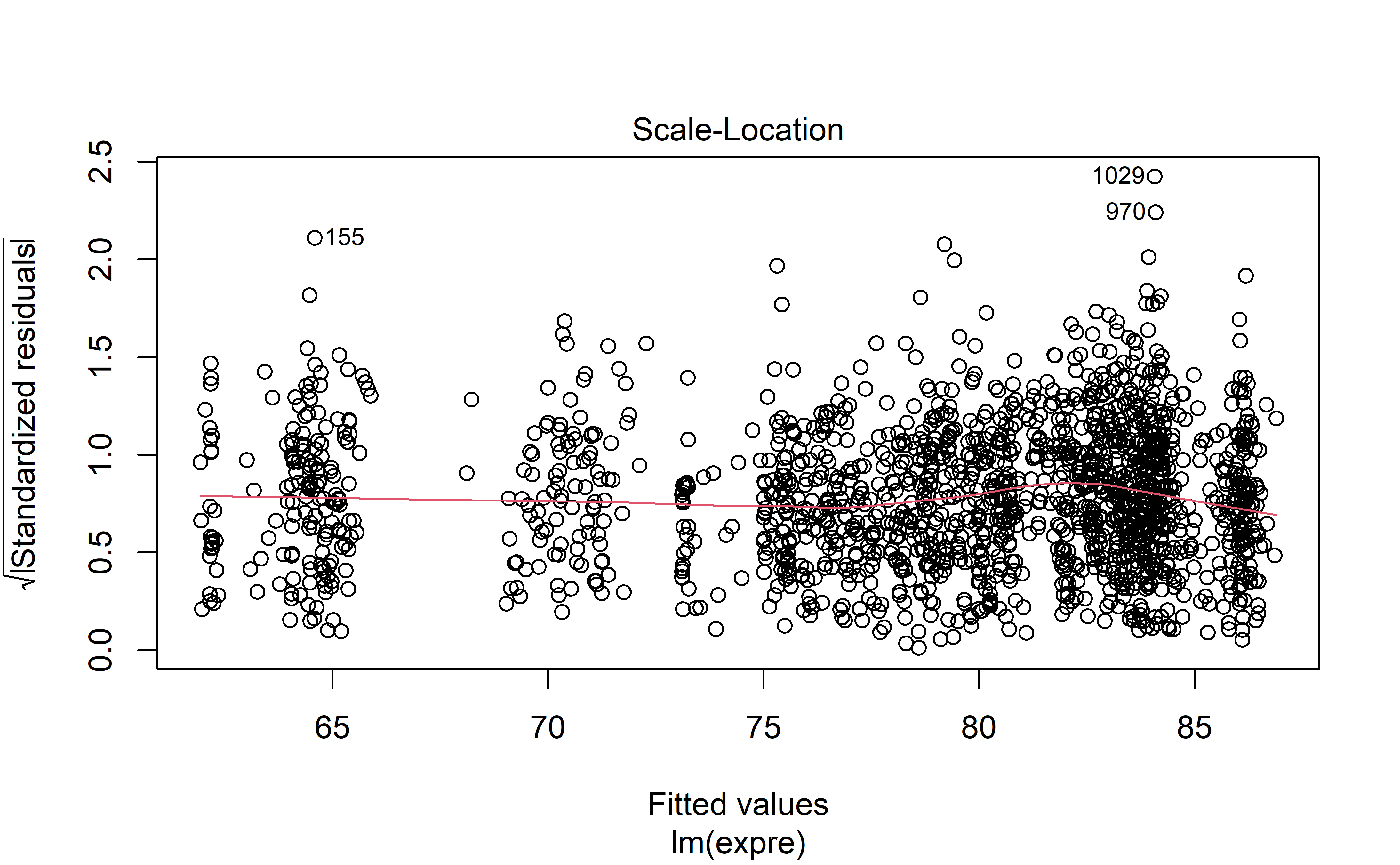
plot(mod, 4)